Lightroom Mobile review for iPad
I’ve been using this interesting app for a few weeks now, and I thought it was time for a Lightroom Mobile for iPad review. This app is currently only available for iPad from 2.0 upwards, but Adobe will be releasing an iPhone and Android version within the next few months.
The basics of Lightroom Mobile for iPad
To start with my Lightroom Mobile review, I’ll quickly explain the basics: Lightroom on your desktop syncs with the downloadable app through Adobe’s creative cloud environment. Once you have signed into your CC account on both devices, you’ll find an All Synced Photographs tab in your catalog navigator. One can simple drag collections to this tab, and it will automatically sync your Lightroom library on both devices. On the mobile app, you’ll see all your collections neatly organized according to the folder structure you made on your desktop. All edits done inside your mobile app will show up on your desktop virtually immediately. Very simple yet genius idea Adobe implemented here.
The app does not download the full RAW or jpg files, but instead uses the previews generated during import. All basic Lightroom functions are available, so I’ll quickly run through all the screens with you.
Lightroom Mobile App structure
Start page
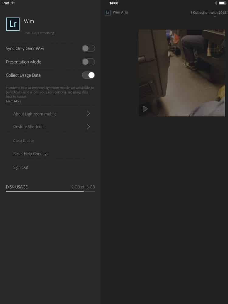
Here you’ll find your synced folders and some basic settings. Tapping on the desired folder will open up the folder stream.
– Sync only over Wifi: avoid roaming charges if desired and only sync when a WiFi connection is available
– Presentation mode: will show a pop-up where gestures and clicks are placed
– Gesture shortcuts: Since the iPad supports multiple finger gestures, Adobe has made smart use of this functionality and assigned different shortcuts. These are in-line with the feature assigned by Apple on iPad, so you’ll quickly get the hang of it.
Grid and Loupe menu
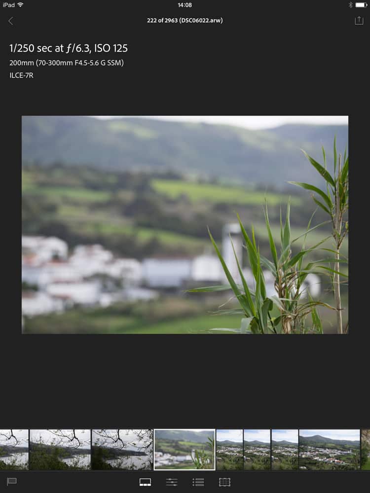
As in the image scroll bar in the full Lightroom version, your selected picture is displayed in large format with a scrollbar on the bottom. All relevant metadata like camera, shutter speed, ISO lens, focal length, and aperture are displayed on the left hand, and you’ll also find the histogram on the right hand.
Tapping the selected picture twice will zoom in, so you can check detail focus and choose your best shots for further editing. Swiping down up or down will flag the images you want to use.
Adjustments menu
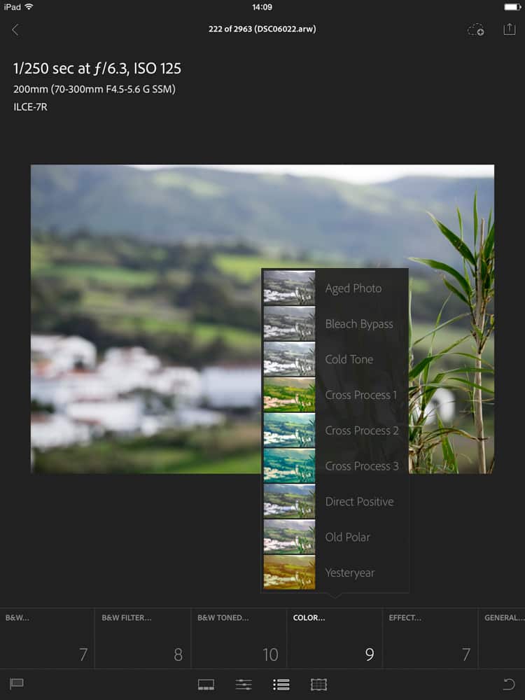
This is similar to the Develop module in Lightroom desktop. White balance, Color temp, tint, Auto tone, contrast, whites, blacks, clarity, vibrance, saturation, B&W, B&W filter, B&W toned; color and effect are all available. These functions are easy to adjust by swiping the screen. Currently, only Adobe’s own presets and effects are available, but perhaps you’ll be able to sync your own in the future.
Crop menu
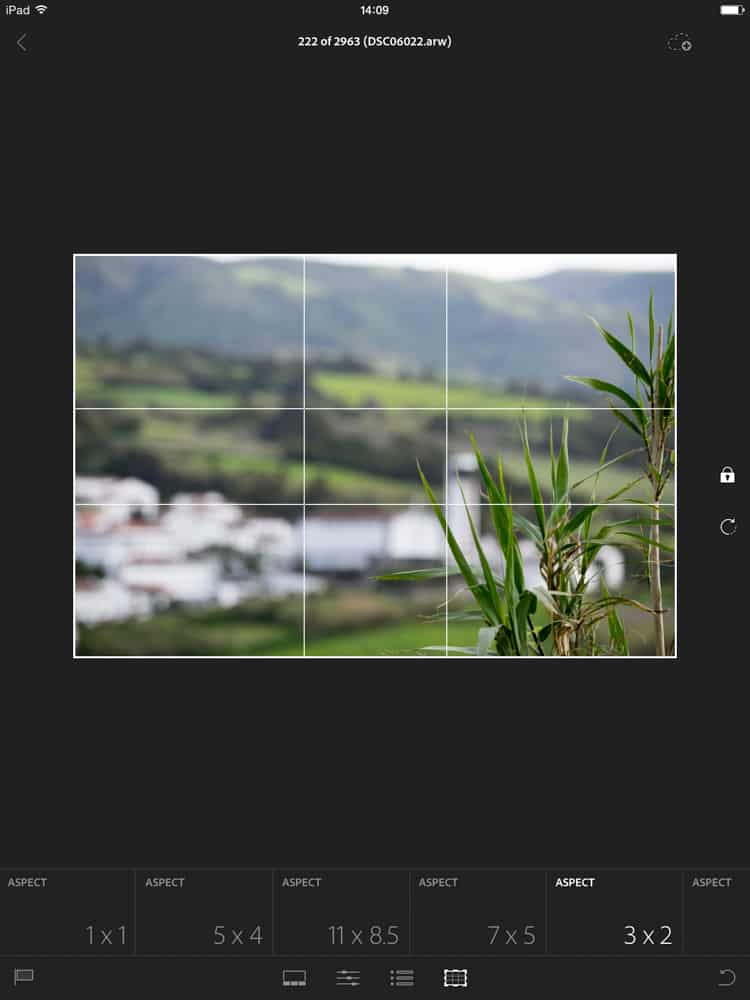
The crop menu allows you to switch between different crop values to explore what suits the image best, and manually change crop and rotation if desired.
Conclusion
During my month of testing for this Lightroom mobile review, I’ve found this a very useful app. Not only does it allow you to do all the fundamental editing and selecting from your couch, on the train or even in the bathroom, but also you have the advantage of viewing your images on another screen. I use 2 calibrated screens in my desktop setup, yet still it is very useful to check it on a 3rd mobile screen to avoid surprises later on. Besides this, the Lightroom Mobile app makes a breeze out of editing tasks like straightening horizons, adjusting white balance, black- and white points and contrast. You can even try out some effects to get a feel for what would work with your images. Everyone using Lightroom, who has an iPad should try it out, and I’m sure it will make your girlfriend jubilant having you next to her on the couch for a couple more hours per week!


iPad Pro 2020
Good for Artists and those who like to play games.
Gaming – Works fine with my Xbox one controller while playing games.
Apple Pencil – Bought Apple pencil (second generation) separately though, cost me 10,500, drawing and taking notes is a completely different experience on this.
Performance is I can say its a beast, no lag, screen’s butter smooth, camera’s good (don’t expect to be a professional like one with 11 Pro Max, anyhow iPad is not meant for photography.
Lidar Sensor – seems to be useful in AR, nothing apart from AR. But AR’s visibility has increased a lot, thanks to Lidar. 👍🏻
The battery is too good, I got a backup of 9 hrs on a continuous usage with screen brightness adjusted to 80%.
Idle time is you get 2 to 3 days of backup (anyhow who would leave iPad remain idle though)
Overall its a beauty 🤩